Emanuela Frattini Magnusson trained under the guidance of her father Gianfranco, considered one of the creators of Italian design of the 1960s. After an international training that led her to collaborate, first in London and then in New York with famous studios professional, she founds her EFM brand with which she signs architecture and design objects all over the world.
Why do you use laminate?
Besides the obvious practical attributes, laminate offers a wide range of interpretations: from creating a continuous homogeneous colored (or neutral) surface, to decorative patterns or simulations of other materials. It has transcended its purely utilitarian roots to acquire other functions.
Which ways? For instance, how do you use it in your architecture and interior projects?
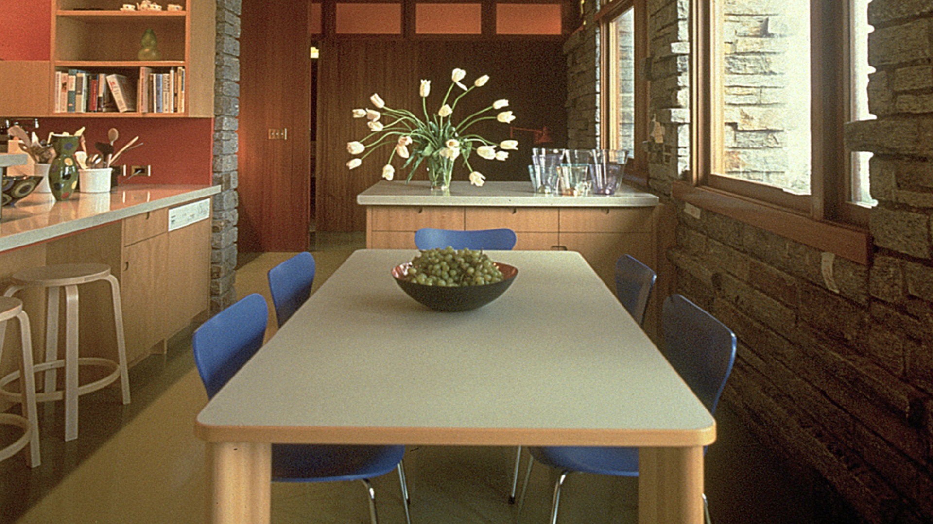
I have used laminate in projects that range from residences to workplaces and exhibitions, from large vertical surfaces to horizontal counters, to cabinetry and furniture pieces. It is a very good solution for curved surfaces. I have covered columns and created curved display signage using sheets of laminate. The combination of durability and esthetic versatility is difficult to beat.
Ettore Sottsass said that we must not be afraid of artifice: there is also evil in nature. He used laminate to fly with his design imagination. What is its potential today?
Artifice is not a negative, what I do object to is the appearance of deceit. Laminate offers endless possibilities, especially today with digital printing and photography, to create the illusion of other materials. I see bigger potential in creating spatial and chromatic illusions than to try and mimic materials like wood or marble. The simulation of other materials should be used to create a metaphor, not to tell a lie.
What is the relationship between artificial and natural in your projects?
It is not a prerequisite or a consideration that I worry about as such. My main concern is to use materials that are appropriate for its use and create a harmonious combination when used together. It is my general belief that individually good objects and finishes can always coexist. Glass is not natural, nor is veneer. The contrast between artifice and nature enhances both and creates interest and tension, without being the primary concern of the project. It flows naturally from the appropriateness of use.
How important is sustainability in your design thinking?
It is an integral part of what I do, to the point that I wish this question would not have to be asked any more. It should be second nature, like designing a project to meet code – it should be implied. In addition to the composition and recyclability of materials, the most important contribution we can make is to design for the long term, so that things do not end up in a landfill after a couple of years. Durability is one of the best things we can strive for to help the environment.
Surface design is part of the iconography of the history of Italian design. How do you imagine it can evolve from a graphic or chromatic point of view?
Italian design is not afraid of decoration, the most iconic example being Gio Ponti who while being a Modernist master also made extensive use of color and pattern in his work. Color and pattern are tied to the visual culture and fashion of the times. Color trends start in fashion and trickle down into interiors. Today’s technologies make it easy to pick up on these trends and translate them into surface materials like laminate. It is an excellent design tool that facilitates the insertion of elements of whimsy and chromatic effects into any project, and adds a more customized, personal character to the project vocabulary.


